A booking site that answers the next question first.
How an EV scooter rental company with no web presence got a mobile-first website for anyone to find, understand and book — without going through WhatsApp.
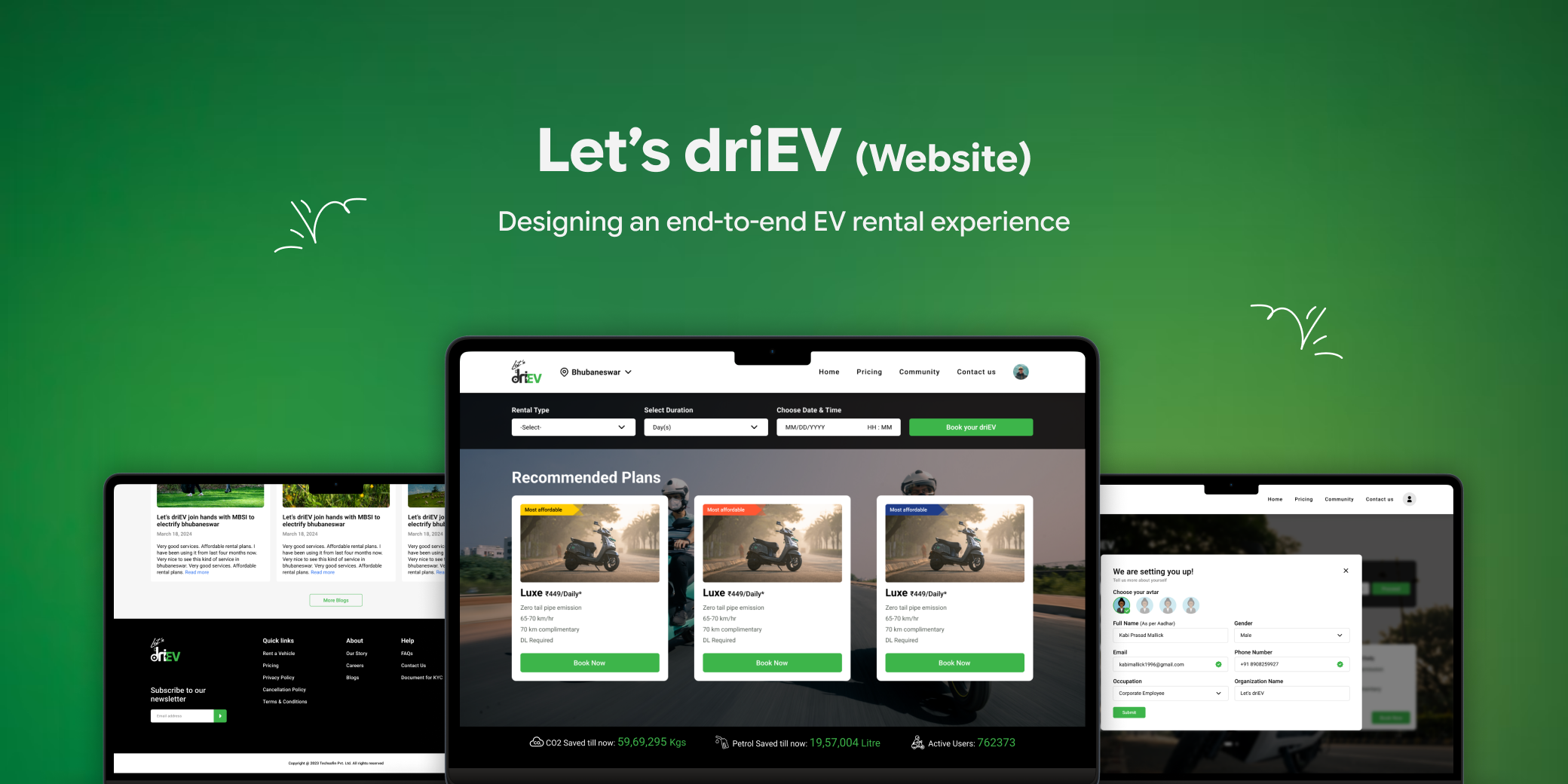
This site sells the rental model, not the campus one
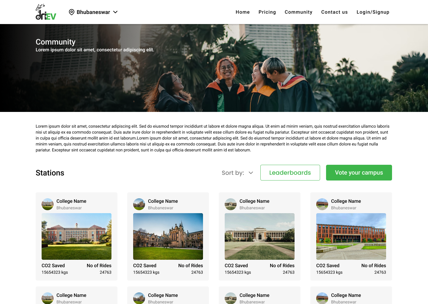
driEV runs two business models. The website serves the public Rental model, with fixed plans. The campus Community model lives in a separate native app with its own pricing — covered in the app case study. I designed the website in parallel with that app.
Customers couldn’t find driEV, price it or book it
The company had a public rental model with daily, weekly, monthly and yearly plans, but no web presence. Everything went through WhatsApp.
- No searchable presence
- No pricing page and no trust signals
- Booking required a WhatsApp conversation
- Prospects dropped off before completing a booking
I drew on interviews from the community app and benchmarked Indian EV and vehicle rental sites. Three points kept people from booking.
Two more things shaped the design. Visitors worried about running out of charge, which is specific to EVs. And most would find driEV on their phone — through Instagram, WhatsApp or Google — so mobile came first.
Answer the next question before the user has to ask it
The aim was to make booking the only logical next step. I mapped the pages before designing any screen.
Site mapSix pages, each answering one set of questions
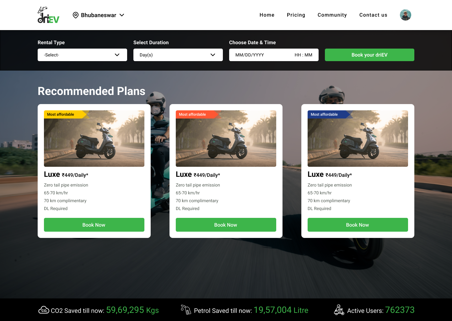
A hero with a single call to action, plan availability, a how-it-works strip, vehicle highlights and trust signals.
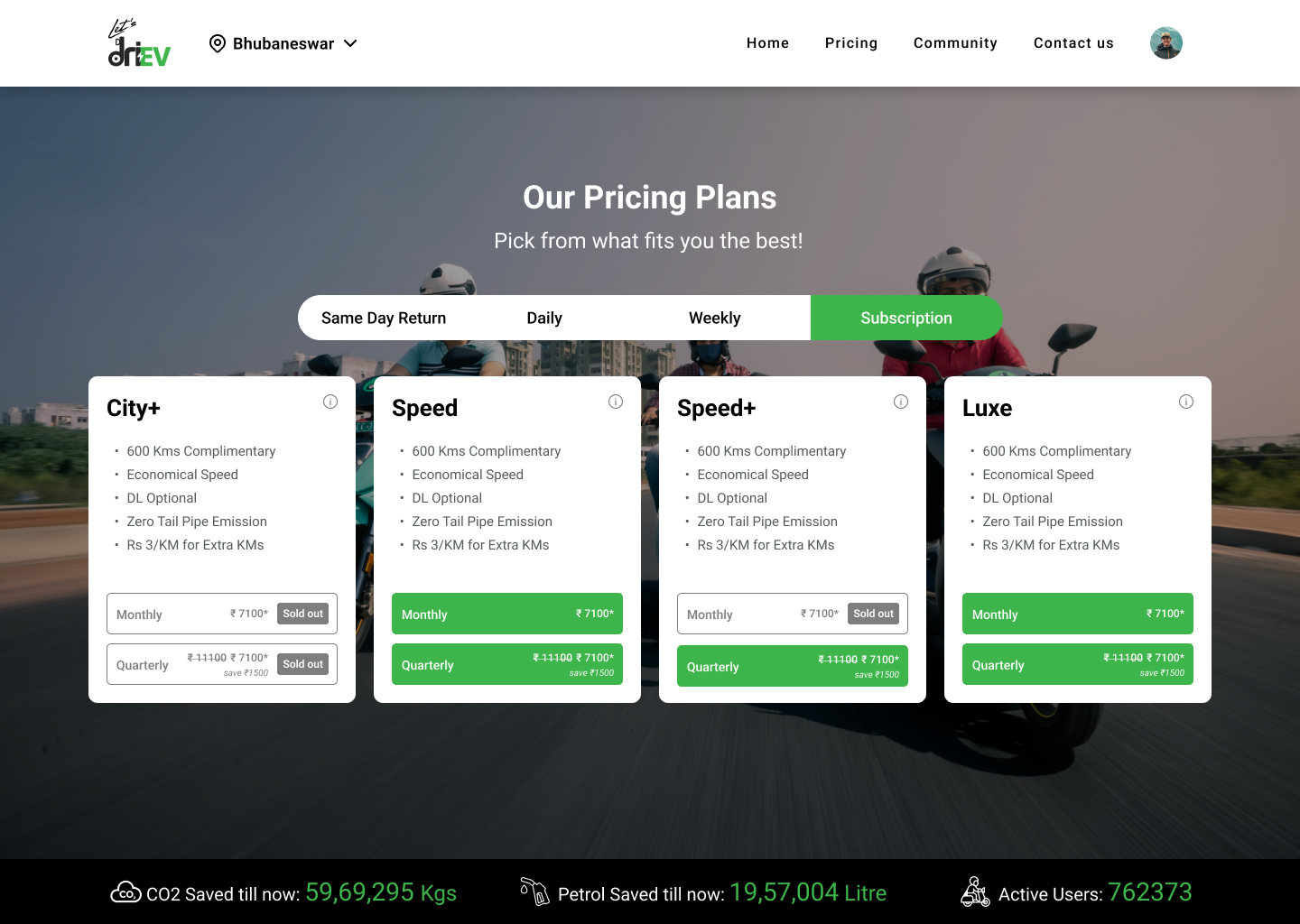
Four plan cards showing included kilometres, price and coverage.
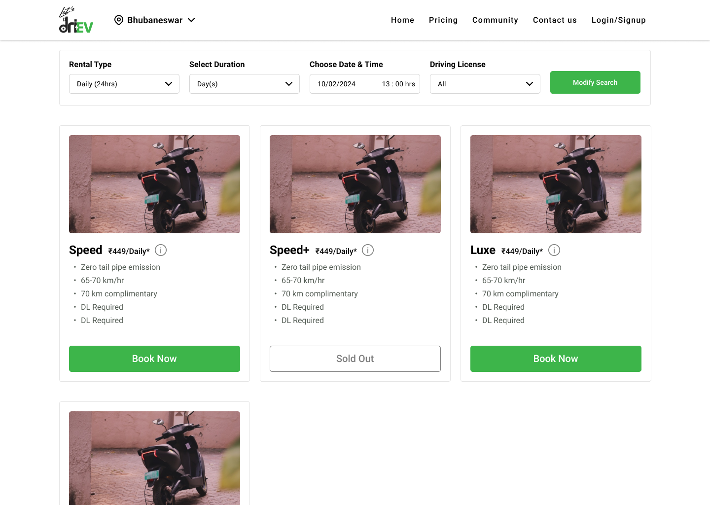
Specs, battery range, features and photos for each scooter model.
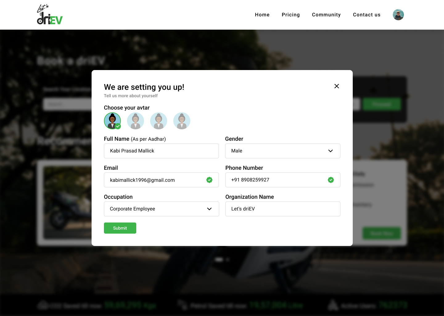
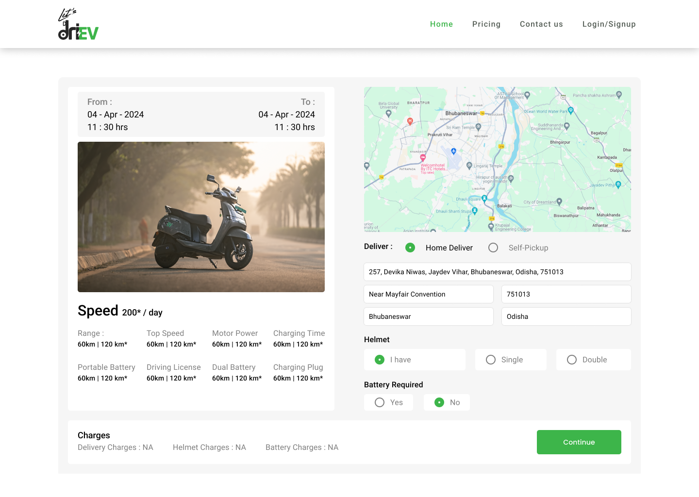
Plan, delivery preference, date, contact details and confirmation.
The step-by-step process, plus answers on range, documents, breakdown support and extensions.
A form, the address and operating hours.
Three choices that shaped the site
Pricing sits on the homepage, not behind a quote form. Plan cards are built to scan in about five seconds.
Competitors used eight to twelve steps. Here, documents are submitted later, so the first booking stays short.
Designed on a 390px frame, then scaled up to desktop. On mobile, a sticky “Book now” bar stays within reach.
Four steps, designed to finish in under two minutes on mobile
- 01Plan
Choose daily, weekly, monthly or yearly.
- 02Date
Pick the start date and add contact details.
- 03Pick-up
Collect from the warehouse or get home delivery.
- 04Confirm
Review and confirm. Documents come later.
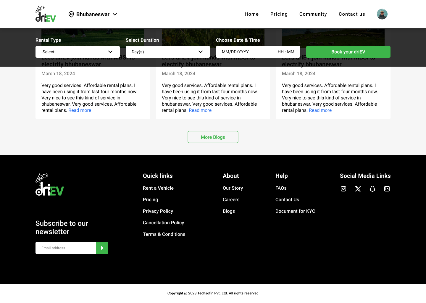
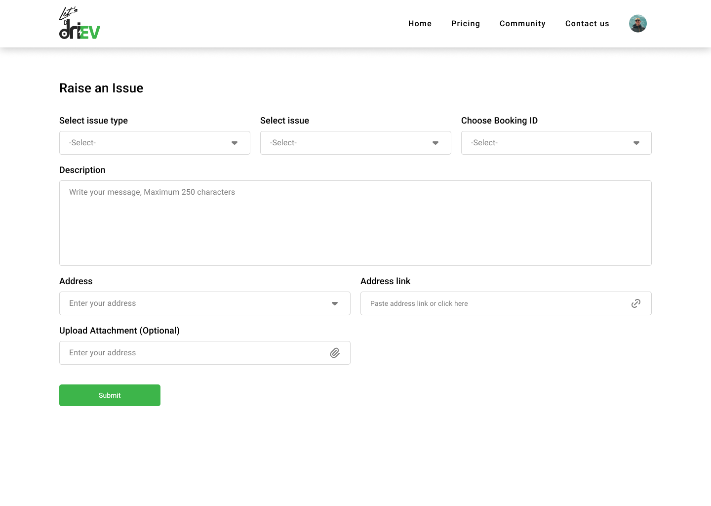
Website screens
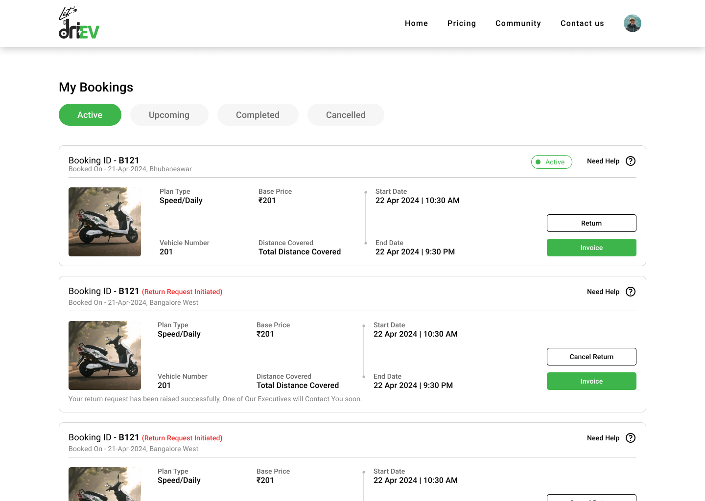
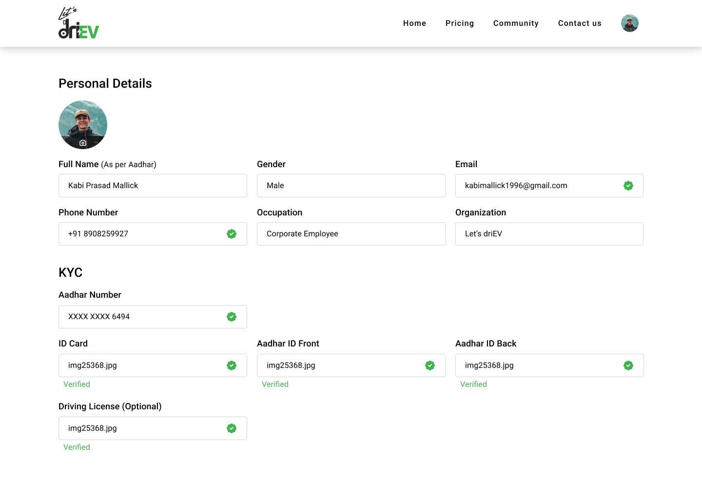
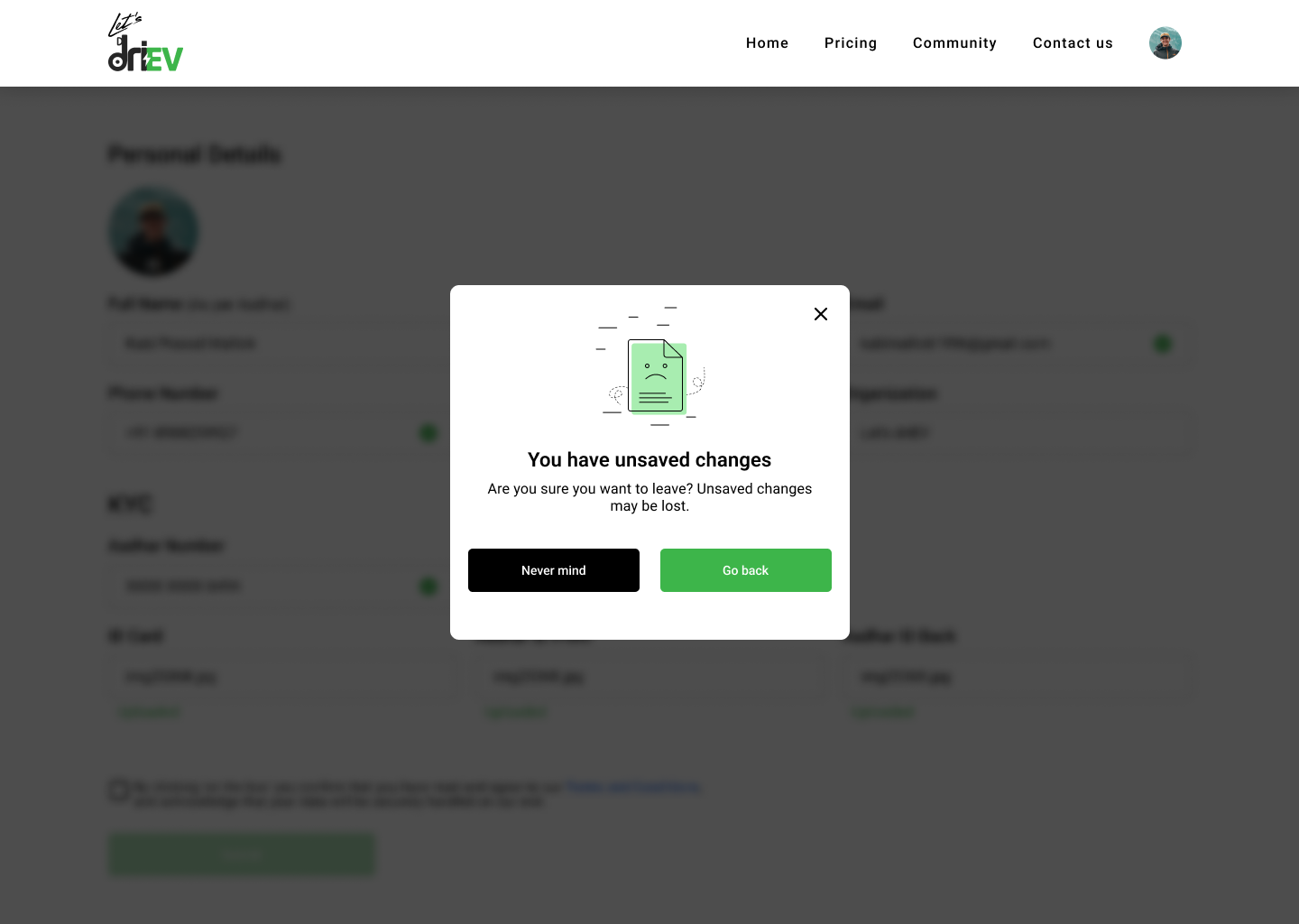
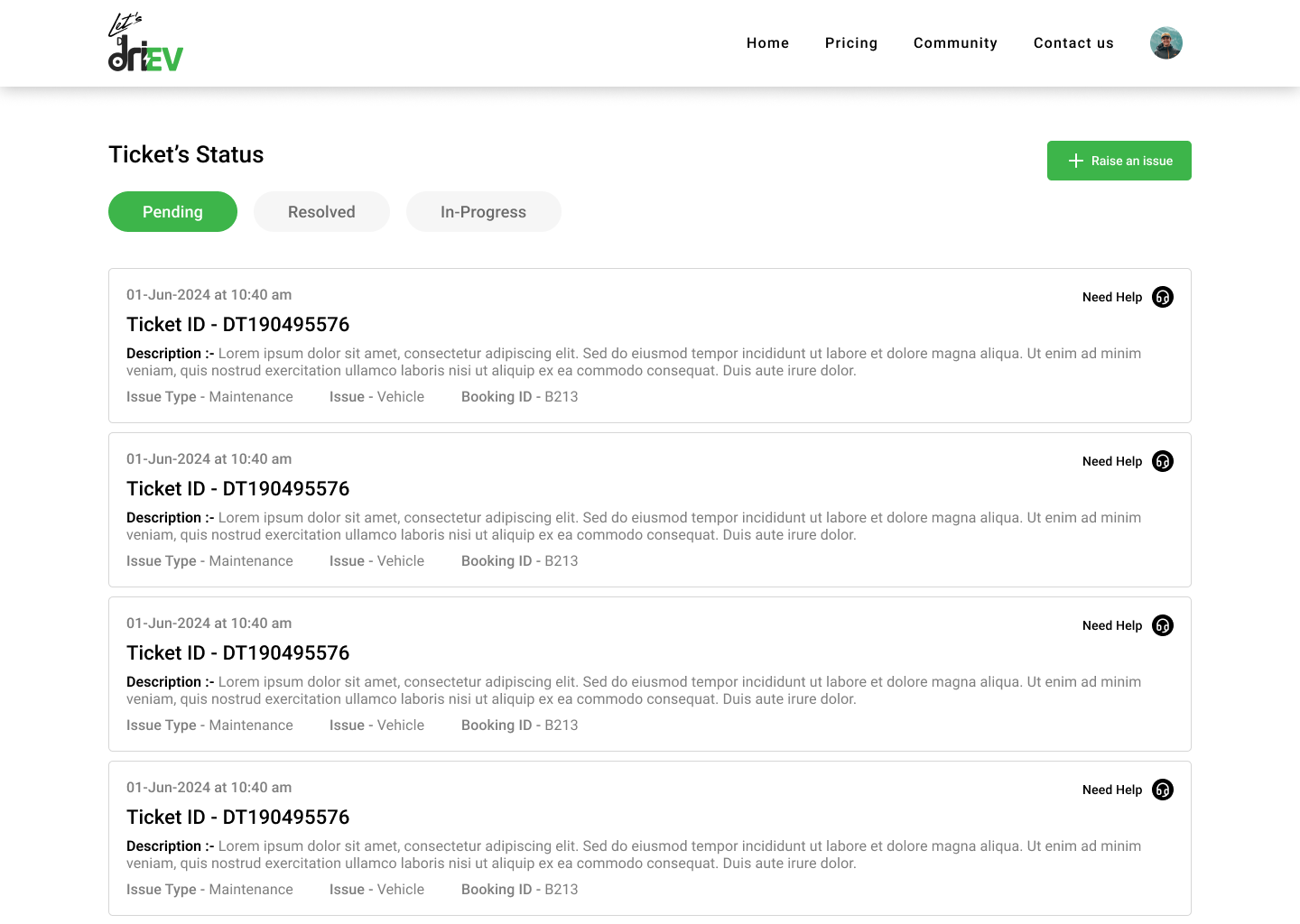
driEV became discoverable, and bookings became traceable
The site didn’t have analytics in place while I worked on it, so I’m sharing what launched rather than estimates.
- The business can now be found online
- WhatsApp is out of the conversion path
- Bookings are recorded in a system and can be traced
- The website and the community app share one brand
Trust comes from clear answers, not more pages.
Price, process and what happens after payment were the three doubts that stopped bookings. Putting each in plain view, and keeping the flow short, did more than any visual flourish. The community app’s interviews fed straight into this site.
Next case study