All work
Magica.AI · Product design case study

Simplifying an AI‑native product into a conversation.

How a multi-model AI product moved from a complex, model-driven interface to a conversation-first experience — and how a scalable, mobile-first design system grew out of that shift.

Ongoing · v1 shipped on web & mobile, now building the design system and web app
Role
Product Designer
Scope
End-to-end: UX, UI, flows
Platforms
Web & mobile apps
Design system
Mobile-first, scalable
Team
CEO, product team, developers, design intern
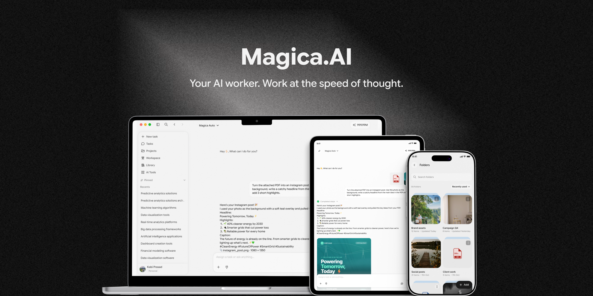
Magica.AI web and mobile screens
Product context

One product for many kinds of AI work

Magica is an AI-native creation and productivity platform. People use it for quick everyday requests and for longer workflows like text, code, image and video generation, and other AI-powered tasks.

It sits in the same space as ChatGPT, Claude, Gemini and Manus, but brings many AI capabilities into one experience. My job is to make it easier to understand, easier to use and consistent across web and mobile.

When I joined, the experience was model-driven: users had to decide on models, filters and controls before reaching the actual task, while the product kept changing through ongoing discussions between the CEO, Product and the development team.

Core design question

How can we reduce unnecessary decisions and make a multi-model AI product feel as simple as sending a message?

My role & ownership

Primary designer across the product lifecycle

I started on my own, then mentored a design intern who joined the team. I turn product and engineering requirements into flows and interface decisions — I redesigned the web experience, designed and shipped the first mobile app, and I’m now building the design system and the new web app.

  • Product UXHigh
  • User flowsHigh
  • UI designHigh
  • Design systemHigh
  • Prototyping & interactionHigh
  • Developer collaborationHigh
  • Team directionGrowing · mentoring a design intern
Constraints & reality

Designing without a reliable dataset

Magica’s users are mostly international, and there was no analytics or research data showing where people dropped off, converted or switched flows. So I worked from product reasoning, UX principles, competitor conventions, implementation feedback and steady iteration — without treating assumptions as facts.

  • Limited access to product analytics
  • No dedicated UX research dataset
  • Rapidly evolving requirements
  • CEO-led decisions, followed by design execution
  • Web and mobile both had to be supported
  • Make it usable fast, then improve step by step
From configuration-heavy to conversational

Users were asked to understand complexity the product could handle

Earlier direction
  1. Choose a model
  2. Work through filters and configuration
  3. Then begin the task
Evolved direction
  1. Start with the task
  2. Send a prompt
  3. The product picks the model or capability
  4. Generate the result
Users make more decisions before starting.Users start by describing what they need.
Model selection is prominent.Model and capability selection becomes contextual.
Many filters and controls add cognitive load.Visible complexity is reduced where it isn’t needed.
The interface reflects technical complexity.The interface focuses on the user’s goal.
Each screen evolves on its own.Reusable patterns create consistency.

Design principle. Move complexity away from the user wherever the system can make the decision for them.

Product evolution

Five stages, not one redesign

Magica didn’t jump from an old design to a final one. The experience changed through several iterations, and the design focus changed with it.

  1. Stage 1 Shipped

    Initial experience

    Model selection, filters and several controls before starting.

    Focus: understand the structure and make it usable.
  2. Stage 2 Shipped

    Simplification

    More product logic moved behind a conversational entry point.

    Focus: reduce cognitive load and unnecessary decisions.
  3. Stage 3 Shipped

    Iterative UI updates

    Screens and flows kept changing as the product evolved.

    Focus: redesign and improve each affected area.
  4. Stage 4 Shipped

    v1 on web & mobile

    Major screens and flows became usable across the product.

    Focus: consistency, and preparing for scale.
  5. Stage 5 In progress

    Design system & new web app

    Reusable, mobile-first components and patterns — and the web app built on them.

    Focus: a foundation for future product development.
Core experience flow

A conversation, not a configuration screen

One conversational entry point that still supports every generation capability. Users reach a useful result without understanding the model architecture underneath.

  1. 01Start

    The user opens the product and begins with a task.

  2. 02Prompt

    They describe what they want in natural language.

  3. 03Interpret

    The product picks the right capability or model.

  4. 04Generate

    Text, code, image, video or another output is produced.

  5. 05Review

    The user checks the result and keeps refining it in the conversation.

  6. 06Complete

    They save, continue, export or start another task.

Design process

A pragmatic product‑design loop

Less about a perfect experience in one pass, more about shipping a usable product while continuously reducing complexity.

RequirementUnderstand current flowIdentify frictionSimplifyDesignReview with CEO & engineeringIterateImplementSystematize
  • Understand what exists. I studied navigation, controls, model-selection behaviour and the major task flows to see what worked and what added complexity.
  • Translate direction into UX. Each requirement from the CEO and developers became information hierarchy, interaction patterns and visual consistency.
  • Simplify the interaction model. From many configuration choices to a conversation-first start, letting the system choose the capability where it can.
  • Design, implement, review. I worked with developers on web and mobile, reviewed the build and iterated on inconsistencies and usability issues.
  • Establish a system. Once flows stabilised and screens multiplied, I moved from screen-by-screen design to a mobile-first design system.
Interface redesign

Not more UI. Easier to understand and faster to use.

I redesigned the existing web experience first, then carried the evolving product direction into mobile.

Clear entry point

The primary task is obvious the moment the product opens.

Progressive complexity

Advanced controls stay available without being the default path.

Consistent interaction

Predictable patterns across chat, generation, states and navigation.

Cross-platform

The same product logic on web and mobile, adapted to each platform.

Web

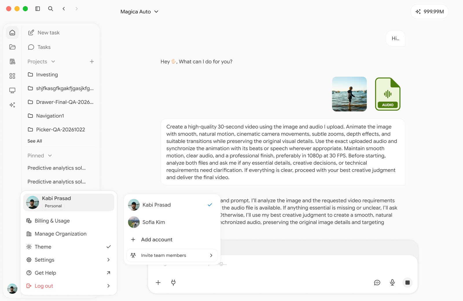
Magica web chat: a single task combining an uploaded image and audio, with the account switcher open
Chat & generationImage, audio and prompt in one task
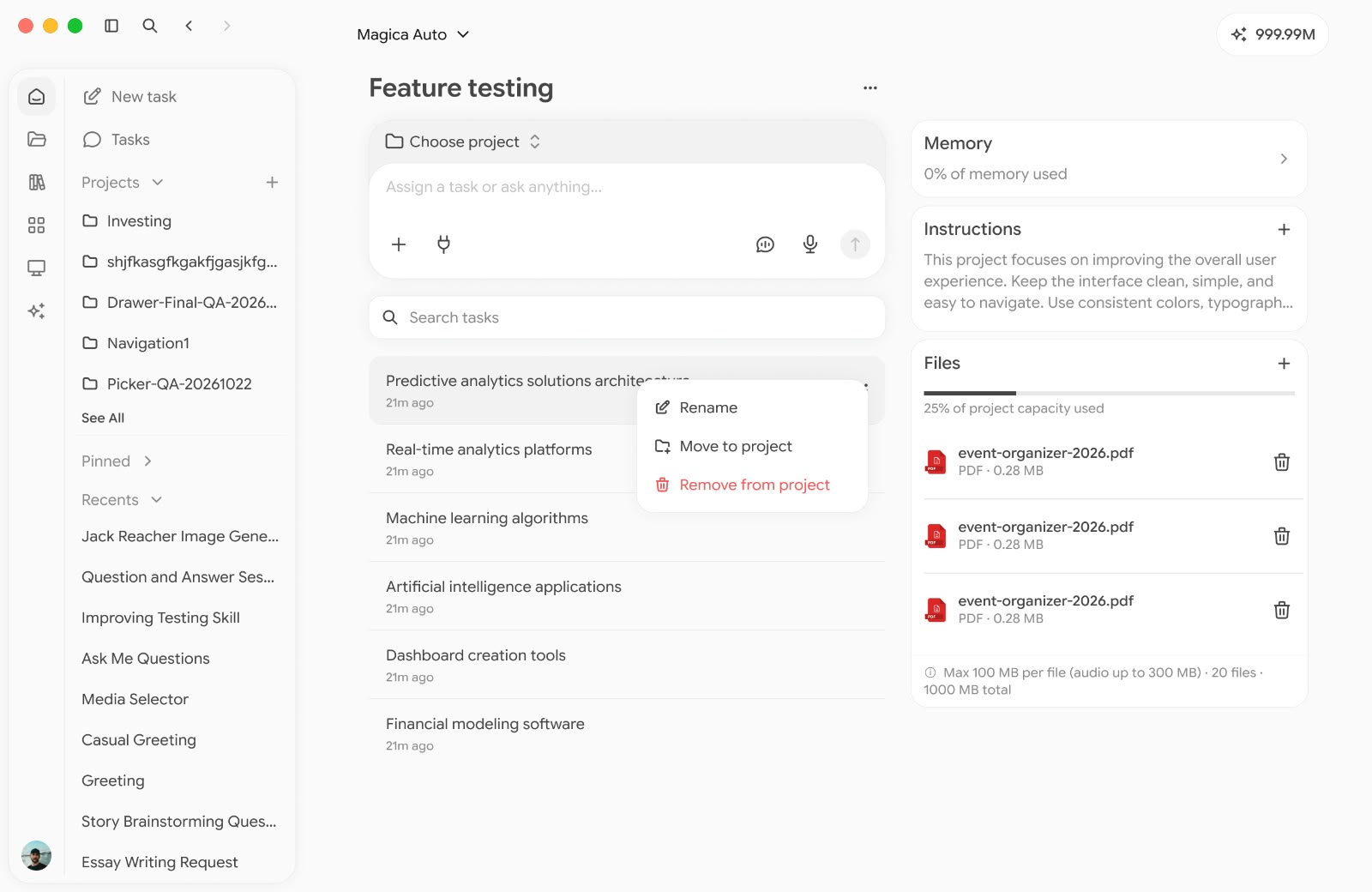
Magica web project page with tasks, memory, instructions and uploaded files
ProjectsTasks, memory, instructions and files
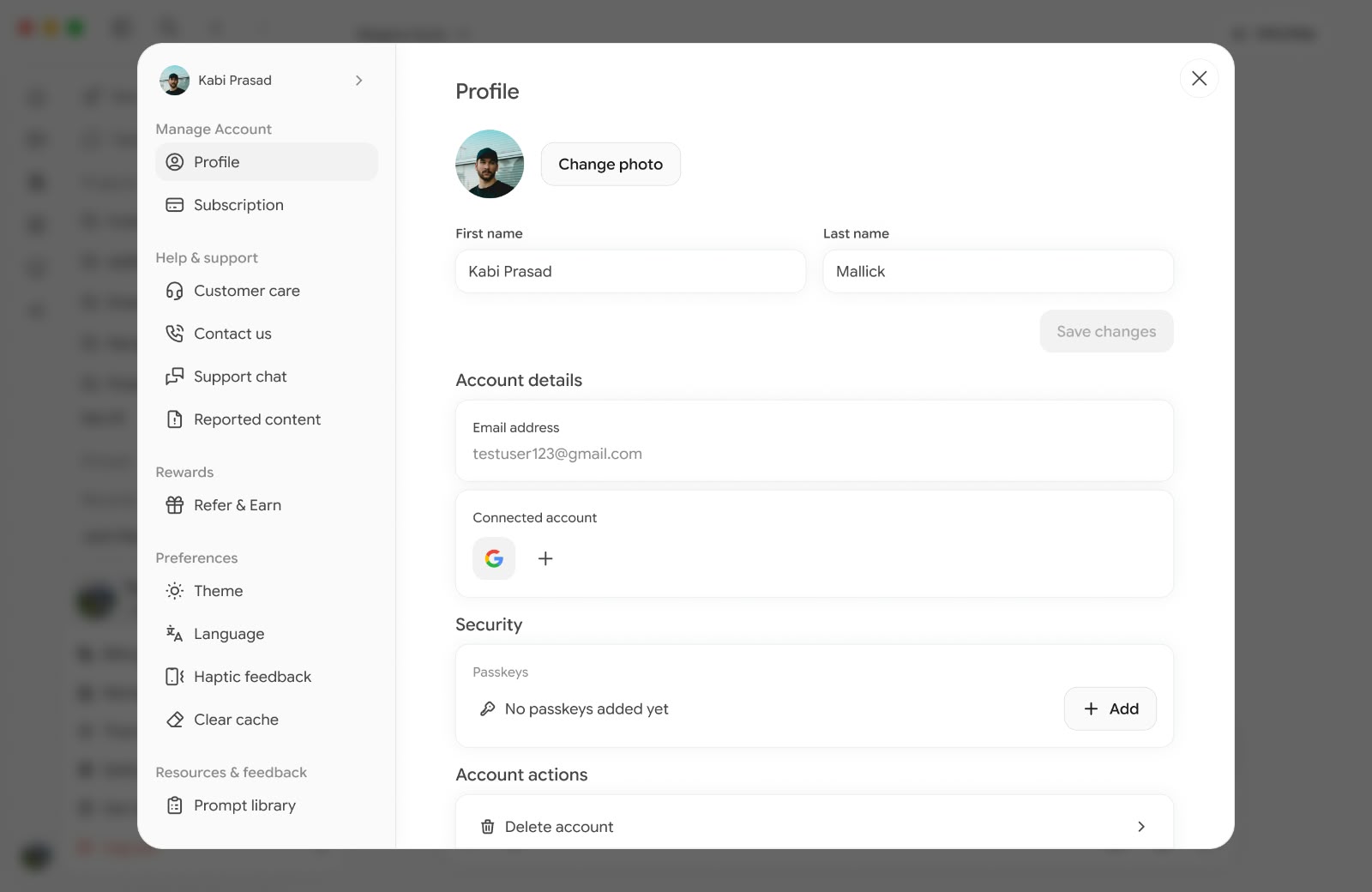
Magica web settings modal showing the profile form and account sections
SettingsProfile, subscription and preferences

Mobile

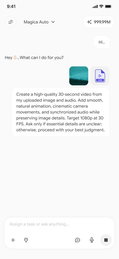
Magica mobile chat with an image and a video attached to a prompt
Chat
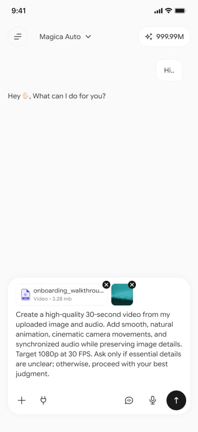
Magica mobile composer with attachments added before sending
Attachments
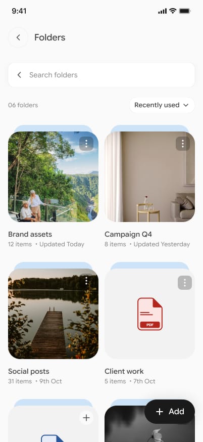
Magica mobile folders grid in the library
Folders
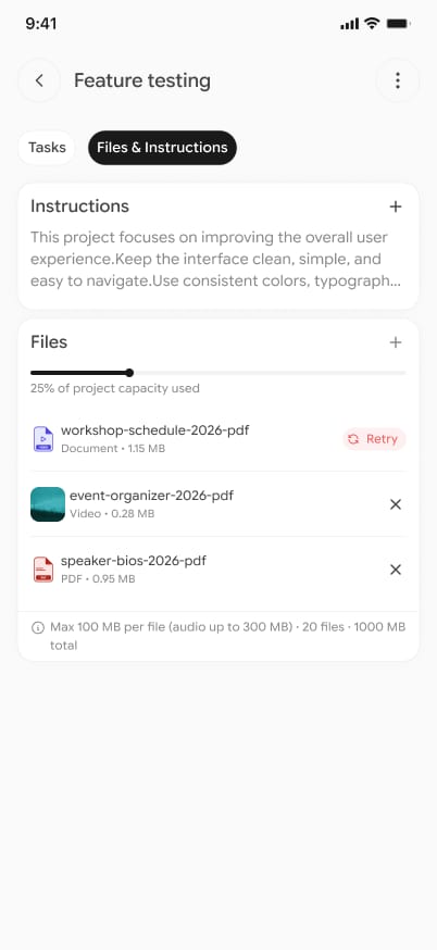
Magica mobile project with instructions and uploaded files
Project files
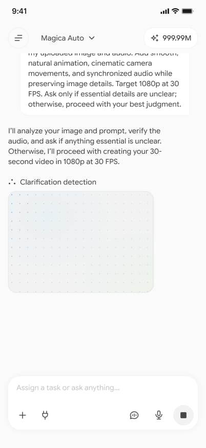
Magica mobile response showing the clarification detection step
Clarifying
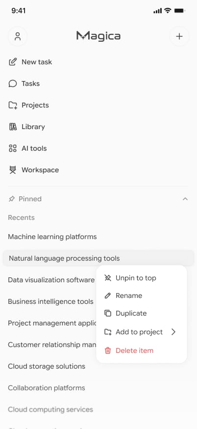
Magica mobile navigation menu with an item's options open
Navigation
Design system In progress

From screen‑level design to a system

Once the core flows were stable, I stopped designing screen by screen and started a mobile-first design system from the ground up — so new screens can be built faster and stay consistent. This is what I’m working on now, alongside the new Magica web app.

Patterns are documented around real product flows rather than abstract components, so the system can be adopted progressively as the product evolves.

Foundations

TypographyColourSpacingRadiusLayout rules

Components

ButtonsInputsNavigationCardsSheetsDialogsTabsAI-specific patterns

States

DefaultHoverFocusDisabledLoadingErrorSuccess

Why mobile first?

Tight space forces stronger prioritisation.

Core interaction patterns settle before they expand to larger screens.

A clear mobile base makes responsive decisions deliberate — web adapts the system instead of duplicating two design languages.

AI-assisted design workflow

AI as an accelerator, not a replacement for product judgment

Magica is an AI-native product, and the design process benefits from AI-assisted exploration too.

  1. Discover

    Structure requirements, compare patterns, challenge assumptions.

  2. Explore

    Generate alternative UX directions, copy and interaction ideas.

  3. Decide

    Apply product constraints, platform behaviour and design principles.

  4. Design

    Build the chosen direction in Figma as reusable components.

  5. Validate

    Review flows with product and engineering, then iterate.

  6. Implement

    Carry approved designs into web and mobile.

Collaboration & leadership

A collaboration model for a fast-moving product

CEO

Product vision, priorities and final calls.

Product team

Product management — requirements, feature scope and roadmap, turned into briefs for design and development.

Developers

Technical implementation, feasibility and iteration feedback.

Me · Product Designer

UX and UI, flows, visual design, the design system and implementation review.

Design intern

Supports ongoing design work, mentored by me and built on the system foundation.

Leadership takeaway. My role shifted from executing individual screens to creating the structure that lets another designer contribute consistently.

Outcome & measurement

A more usable, more structured product foundation

Magica didn’t have analytics in place while I worked on it, so I’m sharing what shipped rather than estimates — plus the metrics I’d track next.

What shipped
  • Shipped the first version of the web and mobile apps
  • Redesigned and iterated the major product screens
  • Moved the interaction model toward conversation-first use
  • Made model and capability complexity less prominent in the main journey
  • Started a mobile-first design system, now in progress
  • Reusable UI patterns that made it easier to onboard a design intern

How success will be measured next

Time to first successful generationPrompt-to-result completion rate Retry & abandonment rateFeature adoption by generation type Retention & repeat generationDesign-to-development cycle time
What I learned

AI products need a different balance of control and intelligence

Reduce visible complexity

If the system can make a good decision automatically, users shouldn’t have to make it first. Design for the user’s goal, not the product’s internal complexity.

Design for evolution

Fast-moving products need systems that absorb new capabilities without redesigning every screen. In a startup, many small improvements often beat one big redesign.

System thinking scales

A good component and interaction system becomes more valuable as the product grows.

Constraints are part of design

When quantitative research is limited, being explicit about assumptions — and reviewing them continuously — is critical.

Magica moved me from traditional product interfaces into AI-native product design and it’s helping an evolving product become easier to understand, use and scale.

Next case study · Before Magica Let’s driEV — Giving students confidence in every ride Three years in EV mobility, where I designed an app from scratch and owned the full journey — entry, booking rules, payment and completion. That end-to-end, developer-close way of working is what I brought to Magica.