Ongoing work — This project is actively in progress. Screens reflect the current design iteration.

Product Design AI App Ongoing

Designing the UI
for an AI that
actually gets things done.

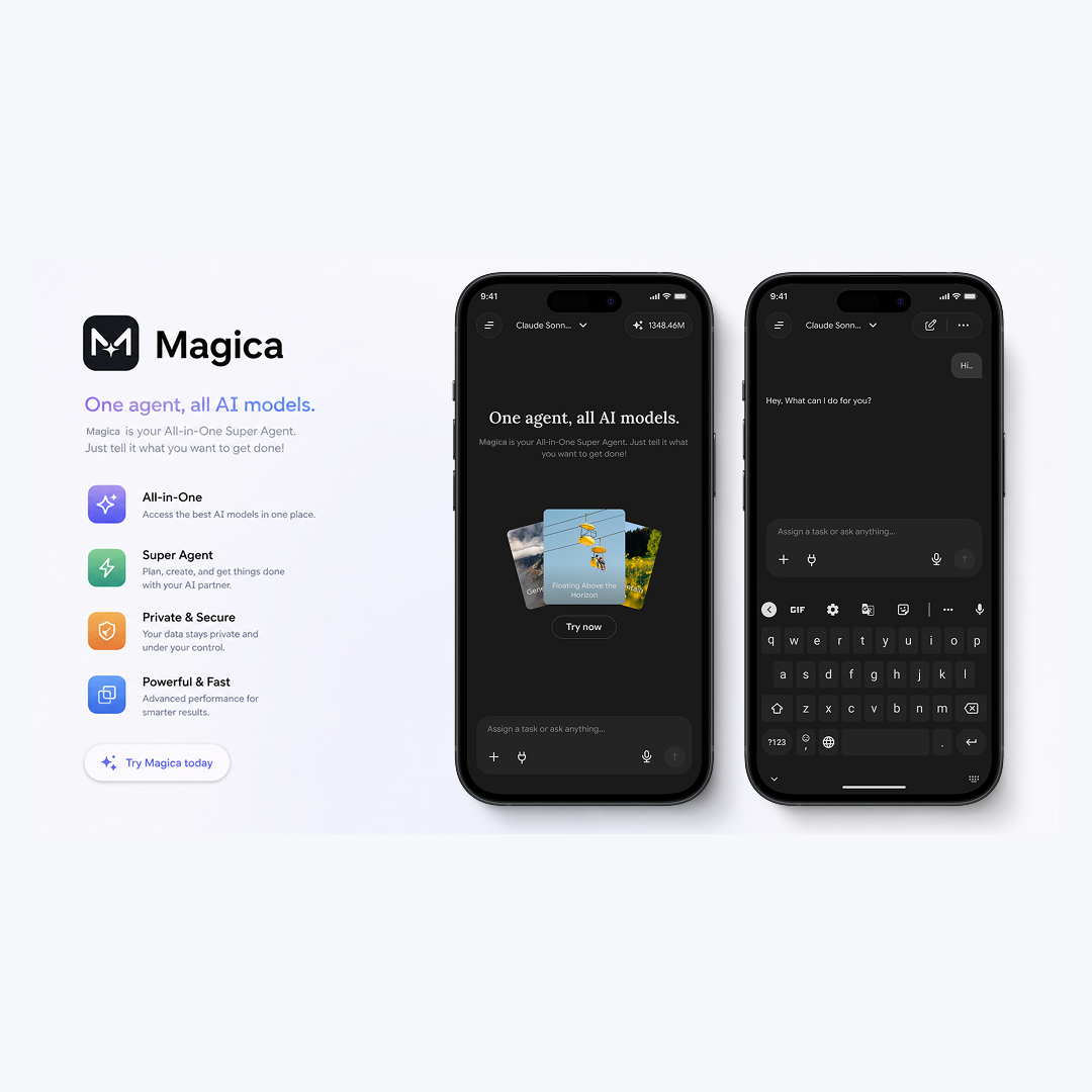
Magica.com is an all-in-one AI super-agent — one interface, all models. I'm designing the full product experience: the agentic chat, task outputs, media library, and a unified design system that works across both the app and the website.

Magica.com · AI Super Agent · App & Web
Magica.com App

My Role

Product Designer

Scope

UX · UI · Design System

Tools

Figma · FigJam · Illustrator

Platform

iOS · Android · Web

Status

● Actively in progress

One agent.
All AI models.

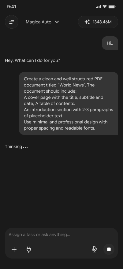
Magica.com is an AI-powered super-agent platform that lets users assign tasks and get things done — generating PDFs, creating content plans, producing audio, video, and more — through a single conversational interface. Under the hood, it routes tasks to the best AI model available. The user never has to think about which model to use.

I joined as the product designer responsible for the full UX and UI of the mobile app and website, and for building the design system that ties them together. This is an ongoing engagement — the screens shown here represent the current live iteration of the product.

Some Screens — current live iteration of Magica.com · Click any screen to expand

Invisible complexity.
Effortless surface.

The hardest design problem with Magica isn't visual — it's conceptual. The product can do almost anything: write documents, generate audio, produce video, create content plans, run web searches, execute multi-step tasks. Most AI tools overwhelm users with that capability upfront.

The challenge was to design an interface where the power is felt but never explained. A user shouldn't need to understand what's happening under the hood — they should just experience results.

⚠️ Design tensions
Powerful but not overwhelming — show capability without complexity
Agentic but controllable — users want to trust it, not fear it
Multi-output but coherent — PDF, audio, video in one thread without chaos
Conversation + task management — two different mental models, one UI
🎯 Design goals
First message → meaningful output in one interaction
Progress always visible — users know the agent is working
Outputs feel polished and downloadable — not raw AI text
App and website feel like one brand — shared design system

Every screen
has a job to do.

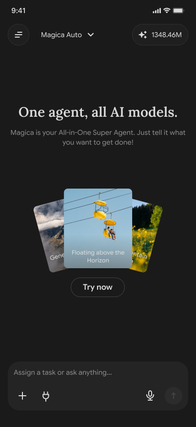
Home screen

The blank page problem — solved.

Most AI chat products open to an empty input and a blinking cursor. Magica opens to a fan of rotating example task cards — visual prompts that show users what the agent can do without reading a word of onboarding. The "Try now" CTA is the only button. The entire home is one intentional nudge toward starting.

Home screen

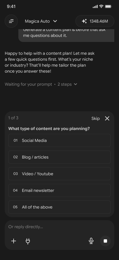
Smart question UI

Ask before acting — not after.

When a task is ambiguous, Magica doesn't guess — it asks. The "1 of 3" question card slides up from the bottom, presenting numbered options the user can tap, or a free-text input if they prefer. This pattern prevents bad outputs and makes the agent feel thoughtful rather than mechanical. The "Skip" option keeps power users moving fast.

Smart questions

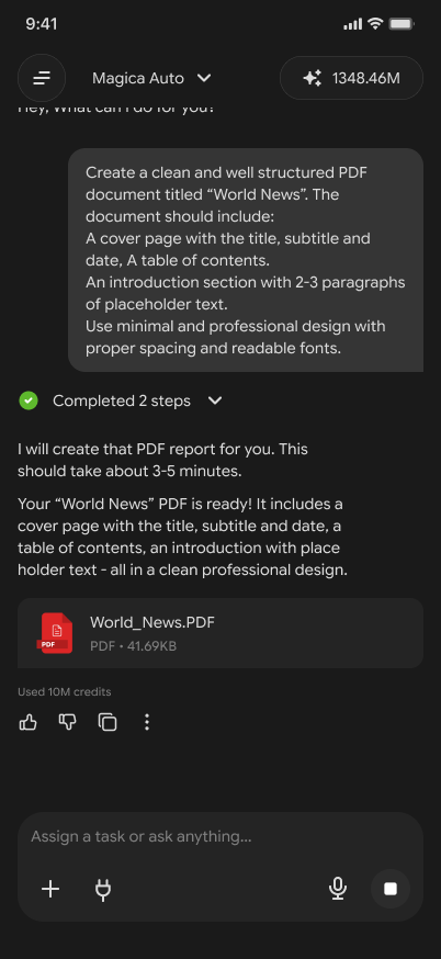
Task output

Results that feel real.

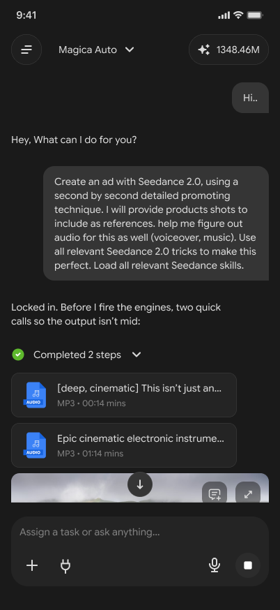
Completed tasks surface as downloadable file cards — not walls of text. A "Completed N steps" progress pill collapses the agent's working process, keeping the thread clean. The reaction row (👍 👎 copy ⋯) and credit usage indicator give users feedback controls and transparency about cost — both trust signals that matter for an AI product.

Task output

Media Library

Your outputs,
always findable.

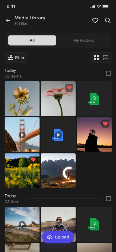
Every file Magica generates — images, videos, audio, spreadsheets — lands in a persistent Media Library. Date-grouped, filterable, with grid and list view toggle and a heart (favourite) system. The floating Upload button makes the library a two-way surface: you can bring in your own files for the agent to work with.

Media library

Navigation

A sidebar that
knows your work.

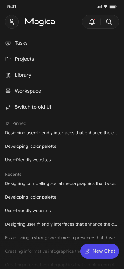
The hamburger opens a contextual sidebar — not just nav links, but a live history of pinned and recent conversations. Each item in Recents is a task title, giving users a meaningful way back into their work. The "New Chat" FAB stays fixed at the bottom, always one tap from starting fresh. "Switch to old UI" is a safety net for power users during the transition.

Sidebar nav

One system.
App and web, both.

One of the core deliverables for Magica was a unified design system that works across the mobile app and the website without diverging into two separate token sets. Every colour, every type size, every spacing value, every component state is defined once and applied everywhere.

The system is dark-first — the product lives on a near-black background. The accent colour is a single purple-to-indigo gradient used with restraint: interactive elements, active states, FABs, and key highlights only. Everything else is handled by layered surface colours and opacity.

Colour tokens — dark surface system

bg-base
surface-01
surface-02
surface-03
accent
success
information
warning
error

Type scale

Display One agent, all AI models.
Heading Assign a task or ask anything
Body Magica is your all-in-one super agent
Label COMPLETED 2 STEPS
🎨

Dark-first token set

Colour tokens defined as semantic roles (bg-base, surface-01/02/03, accent, text-primary, text-muted) — not hex values. Works across app and website without any overrides.

System
📐

8pt spacing grid

All padding, margins, and component sizing snap to an 8pt base grid. Consistent density across the entire product — no arbitrary pixel values.

System
🔤

4-step type scale

Display (serif, large) → Heading → Body → Label. Each has a defined weight, size, line-height, and letter-spacing. No ad-hoc type decisions anywhere in the product.

System
🧩

All-states component library

Input bar, message bubbles, file cards, question cards, FABs, nav items — all built as Figma variants with default / hover / pressed / disabled / loading states documented.

Flagship
🌐

App ↔ web shared tokens

Same token names across the mobile app and the website. No separate "web design system" — one source of truth means the brand stays consistent as both surfaces evolve.

Flagship

What's being
designed right now.

This is a living project. Here's what's actively being iterated on as of the current design sprint:

🔄

Workspace — multi-task project view

A dedicated workspace surface where users can group related tasks into projects, track progress across multiple agent runs, and manage long-running workflows beyond the single-thread chat model.

🌐

Website redesign — shared system applied

Taking the design system built for the app and applying it to the Magica.com marketing website — same tokens, same component logic, unified brand presence across both surfaces.

Onboarding flow

Designing a first-run experience that gets new users to their first successful task output within 60 seconds — without a tutorial, tooltip, or instruction screen.

💎

Credits & pricing UI

Designing the credits system interface — how users understand usage, top up, and see cost per task in a way that feels transparent rather than anxiety-inducing.

More screens coming. As the product ships new features, this case study will be updated with new screens and design decisions. This is what designing an AI product in 2026 actually looks like — iterative, fast, and never really done.

What designing AI
has taught me.

166+ Screens designed and shipped
1 Unified system across app & web
Output types a single UI must handle

What's different about designing for AI

Designing Magica has changed how I think about UI entirely. In a traditional product, you design flows. In an agentic product, you design for unpredictability — the output could be a PDF, a video, a spreadsheet, or a multi-step content plan. The UI has to hold all of that without breaking.

The most important design decision I've made on this project is the "ask before acting" pattern — the smart question card. It sounds simple, but it fundamentally changes the user's relationship with the agent. They feel heard. They trust the output more because they shaped it.

And building a shared design system from day one — not as an afterthought — has saved the product from the fragmentation that kills most fast-moving startup products as they scale.

Next case study

driEV Community App →

View case study