Web Design Booking Flow Conversion

From WhatsApp
to a website that
converts visitors.

Designing driEV's public rental website from scratch — giving every potential customer a clear, trustworthy path from landing to booking, without a single WhatsApp message.

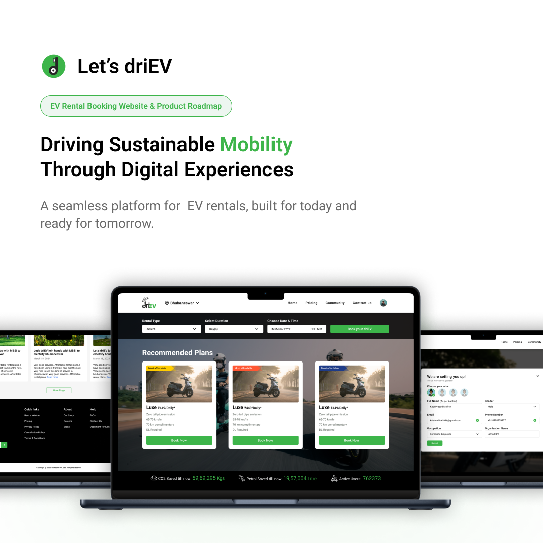
driEV
Let's driEV · Public Website · Rental Platform
driEV Website

My Role

Solo Product Designer

Scope

Research · UX · UI · All pages

Tools

Figma · FigJam · Illustrator

Platform

Web · Desktop & Mobile

Parallel to

driEV Community App

Two products,
one mission.

While I was simultaneously designing the driEV Community App for campus students, the business had a second, entirely separate problem — the public rental model had no web presence. Anyone who wanted to rent an EV for a day, a week, a month, or a year was still being funnelled through WhatsApp.

Unlike the community app's closed campus loop, the website needed to serve anyone, anywhere — and convert them from curious visitor to confirmed booking with as little friction as possible.

🌐 Website audience This case study
Open to everyone — any person, any background
Plans: daily, weekly, monthly, yearly
Pickup from warehouse or home delivery
Fixed pricing per plan — transparent from landing
🎓 Community App (contrast) Separate case study
University campuses only — gated audience
Per-minute + per-km pricing, no long plans
Station-locked, closed-loop pickup and return
Native mobile app, not a website
Design challenge: I was designing both products simultaneously. The website couldn't share the app's campus-specific language or closed-loop assumptions — it needed to work for a first-time visitor who had never heard of driEV before.

No website.
No trust. No bookings.

Before the website, driEV's public rental operation ran entirely on word-of-mouth and WhatsApp. A potential customer who searched for EV rentals in Bhubaneswar would find nothing — no landing page, no pricing, no way to understand what plans existed or how pickup worked.

Those who did find the WhatsApp number faced the same friction as campus students — manual replies, no confirmation, no pricing transparency, and zero trust signals. Many dropped off before ever completing a booking.

Before — no website

🔍No searchable web presence — impossible to discover driEV online
💸No pricing page — users had to ask on WhatsApp to know what plans cost
😕No trust signals — no reviews, no process clarity, no brand credibility
📵Booking required WhatsApp — slow, manual, revenue-leaking

After — driEV website

🌐Full web presence — homepage, pricing, booking, all pages live
💰Transparent plan pricing upfront — daily, weekly, monthly, yearly
Trust-building sections — how it works, FAQs, vehicle specs, delivery info
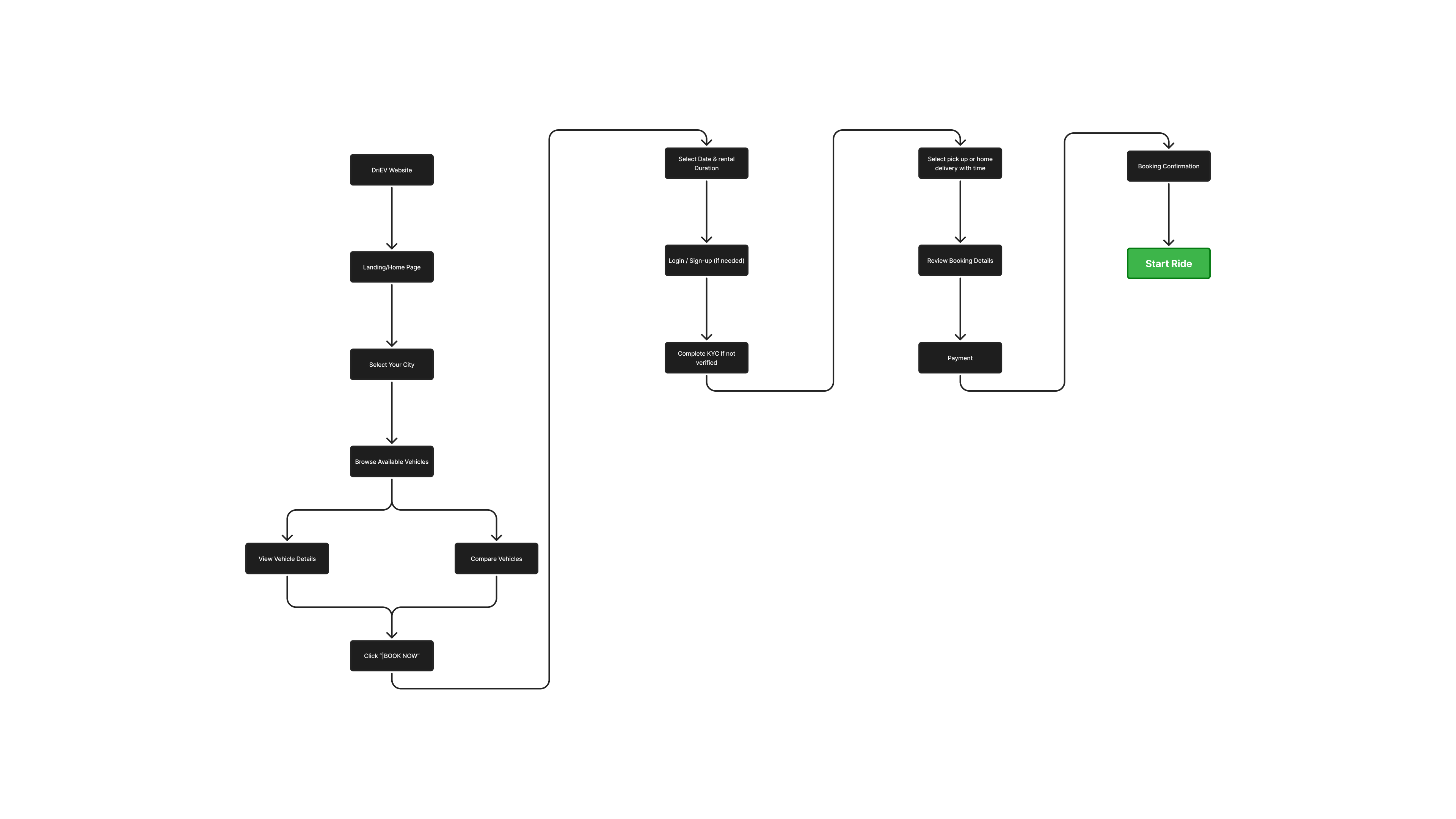
📋Online booking flow — WhatsApp eliminated from the conversion path

What stops someone
from booking?

Since I was running both design workstreams simultaneously, I had to be efficient with research. I used insights from the community app user interviews and supplemented with quick competitive benchmarking of existing EV rental and vehicle hire websites in India.

The patterns were consistent — website visitors drop off at three distinct moments: when they can't find pricing, when the booking process feels unclear, and when there's no sense of what happens after they pay.

💰

Pricing anxiety

If a user can't see a price within the first scroll, most leave. Hidden or unclear pricing is the single biggest trust-breaker on rental sites.

🗺️

Process uncertainty

Visitors didn't know how pickup worked, what documents they needed, or what happened if the vehicle had an issue. Unanswered questions meant no booking.

🔋

EV-specific hesitation

"What if it runs out of charge?" was a recurring concern. The site needed to pre-answer EV-specific doubts that don't exist for petrol vehicle rentals.

📱

Mobile-first reality

Most potential customers were discovering driEV on mobile — via Instagram, WhatsApp shares, or Google. The site needed to work perfectly on a small screen first.

The core insight: A rental website doesn't just need to look good — it needs to eliminate every reason not to book. Trust, clarity, and a frictionless path to payment are the only things that matter.

The question that
shaped every page

With the research pointing clearly at trust and clarity as the blockers, I set a design principle that governed every page decision:

Design principle

Every page should answer the user's next question before they have to ask it — so the only logical action left is booking.

This meant structuring every page around objection removal — pricing before features, process before pricing, FAQs woven into the flow rather than buried in a separate tab.

Information architecture

Pages mapped before any screen was designed

IA diagram

Site map — Homepage · Pricing · How it Works · Booking · FAQs · Contact

Every page,
built with intent.

I designed the full website — not just the homepage. Each page had a specific conversion job to do in the user's decision journey.

🏠

Homepage

Hero section with a single clear CTA, above-the-fold availability of key plan types, a "how it works" strip, vehicle highlights, and trust signals — all before the fold break on mobile.

Core
💰

Pricing page

Four plan cards — daily, weekly, monthly, yearly — each with included km, pricing, and what's covered. Designed so users can compare plans without having to contact anyone.

Key
🛵

Vehicle page

Specs, battery range, features, and photos for each available scooter model. Addressed the EV hesitation directly — range anxiety answered with real numbers.

Core
📋

Booking flow

Plan selection → delivery preference (pickup or home delivery) → date selection → contact details → confirmation. Designed to complete in under 2 minutes on mobile.

Flagship

How it works + FAQs

Step-by-step process section on the homepage, with a dedicated FAQ page covering EV range, document requirements, breakdown support, and extension policies.

Core
📞

Contact page

Simple contact form + address + operating hours. For users who still needed reassurance before booking — a human touchpoint without WhatsApp dependency.

Core
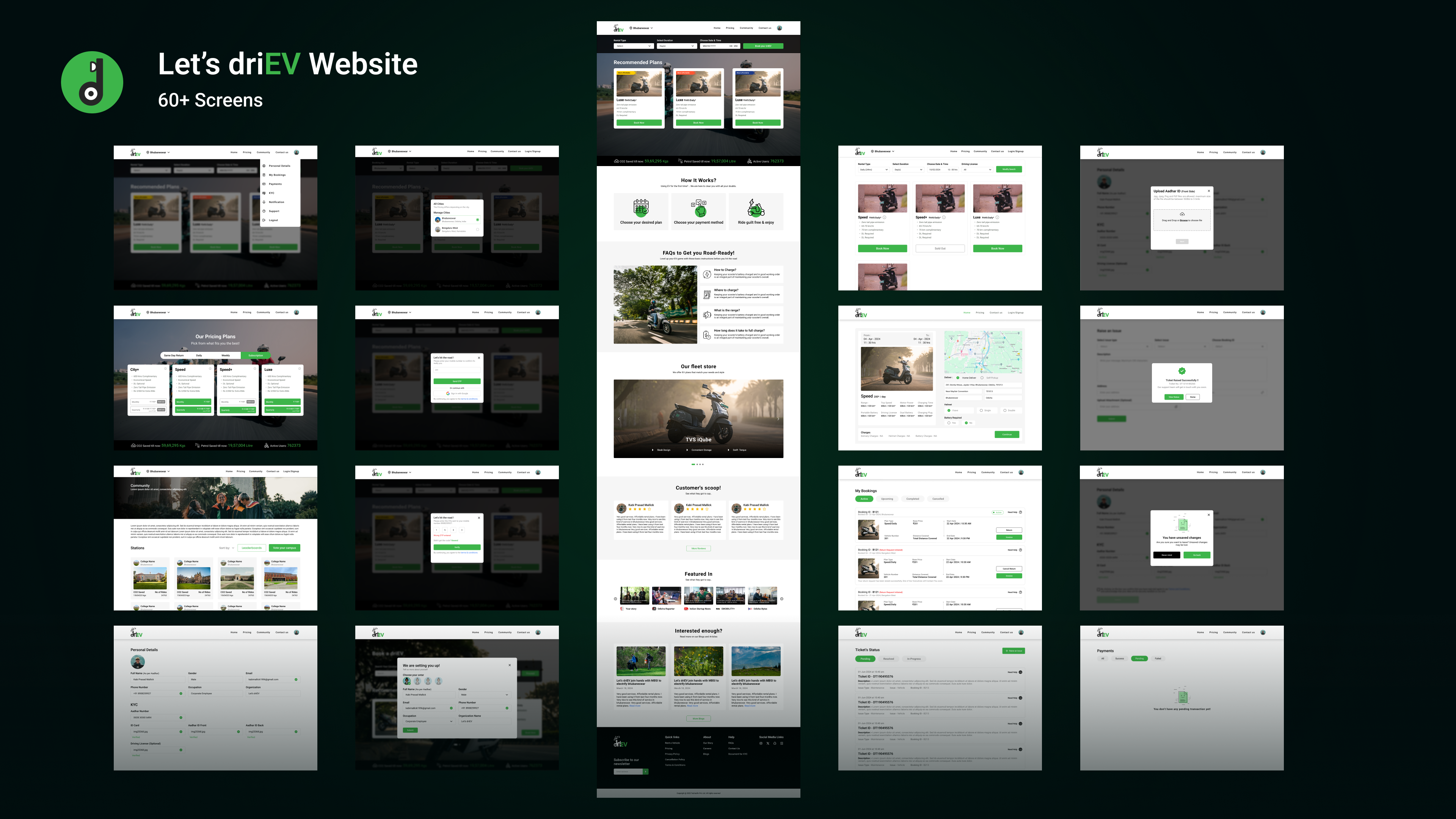
Website screens

driEV Website — Homepage, Pricing, Booking flow (desktop & mobile)

Choices that
moved the needle.

Decision 01

Pricing on
the homepage.

Most rental sites hide pricing behind a "get a quote" form. I put driEV's plan pricing directly on the homepage — not just on a separate pricing page. This single decision removed the most common objection before users even looked for the pricing tab.

The plan cards were designed to be scannable in under 5 seconds — name, duration, price, and one key benefit. No walls of text.

Decision 02

Booking in
4 steps, not 10.

I audited competitor booking flows and found most required 8–12 steps, account creation, and document uploads upfront. I stripped the driEV booking flow to 4 steps — plan, delivery method, date, and contact details. Documents could be submitted later.

The goal was a completed booking in under 2 minutes on a mobile phone. Every additional field is a potential drop-off point.

Step 1Choose plan
Step 2Pickup / Delivery
Step 3Pick date
Step 4Confirm ✓

Decision 03

Mobile-first,
always.

Every page was designed on a 390px mobile frame first. Desktop was an expansion of mobile — not the other way around. This meant navigation, CTAs, plan cards, and the entire booking flow were validated on small screens before scaling up.

The sticky "Book now" CTA bar on mobile — visible at all times while scrolling any page — was one of the highest-impact additions to the conversion flow.

What actually
changed.

0 WhatsApp bookings needed post-launch
4 Rental plans live with full pricing transparency
< 2 min Target booking completion time on mobile
🌐

driEV became discoverable for the first time

Before the website, driEV had no online presence. Post-launch, anyone searching for EV rentals in Bhubaneswar could land on a real product page with pricing and a booking flow.

💬

WhatsApp eliminated from the conversion path

The entire rental booking journey moved to the website. Users no longer needed to message anyone to know pricing, check plans, or confirm a booking.

📋

Every booking now fully traceable

Online bookings meant every plan, date, delivery preference, and user was captured in a system — giving the business operational data it never had before.

🎨

Unified brand across web and mobile

The shared design system meant the website and the community app felt like one brand — not two disconnected products bolted together.

Personal learnings

Designing the website and the community app simultaneously taught me how to hold two very different user contexts in my head at once. The campus student and the general public renter have almost nothing in common — different anxieties, different trust signals, different information needs.

The biggest design win on the website wasn't a visual choice — it was the decision to put pricing on the homepage. Transparency is a design decision. It took more courage than craft.

Next case study

driEV Community App →

View case study